Using Jetpack Compose—and Reaching 50 Million People
This is a story about how we built Threads for Android, which reached 100 million users—split fairly evenly between Android and iOS—less than a week after its launch.
I will take you through key details about the Android side of this launch, how we built the app in five months, adopting Jetpack Compose in the process, and some of our learnings.
The Beginning
I’m going to gloss over some of the details that aren’t specific to the Android launch, because we have covered this before; you can read about it in another blog post: Threads: The inside story of Meta’s newest social app. We also have another blog post about Making Threads for iOS.
Suffice it to say that we wanted to be ready to ship as early as possible if need be, and we had decided that we would use Instagram as a foundation. At its core, a text post is like a regular Instagram post but with optional media.
Early development and exploration for Threads had begun in iOS. Even though the data foundation would be shared with Instagram, however, we still had to figure out how to build the best experience possible in the least amount of time, and the user experience of our text-focused app ended up being significantly different.
Choosing Jetpack Compose
I jumped in early in the project to set the direction and recommended building the app with Jetpack Compose.
Initially, people saw using Jetpack Compose and writing the UI for Threads from scratch as a challenge. I agreed, but I contended that based on our schedule and quality bar, it would be as much of a challenge to use Views and existing components.
We all knew not to reuse our existing Instagram feed components, agreeing that there were enough differences between that system and what we wanted to build. In addition, we had recently come off the heels of a project that had tried to adapt our existing Instagram feed to a new full-screen immersive experience, and that had proved difficult to accomplish on Android.
We at Instagram had also recently decided that Jetpack Compose would be our target UI framework for future development in Android, but we were still waiting on performance improvements in the Compose framework before adopting it in surfaces such as feed.
With Threads, we are focused on building a well-crafted app as quickly as possible that people would want to use. We believed that writing the UI from scratch with Jetpack Compose would help us iterate quickly and keep quality high.
We had been experimenting with Compose in smaller features within Instagram, and we had built up a core kit of Compose-based components that would help us build experiences based on our Instagram architecture. We’d be able to use this as a new base. What we didn’t yet have, however, was a breadth of expertise in Compose.
But we had a back-up plan: Since Jetpack Compose also has interoperability with Views and Fragments, we figured that if it ever came to it, we could reuse our IG components in a pinch.
With our direction decided, we got started.
Building in Compose
The Base
We began with an empty activity.

Then, we added the Compose base, saw some images loading based on the logged-in user, got the initial feed screen to look nice, and added the base of our navigation system.
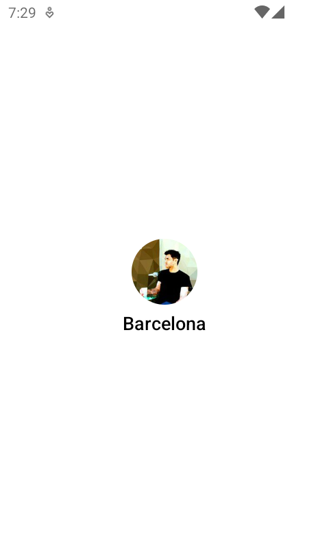

Within a week, we were already starting to look pretty good! But, it wasn’t really representative of what’s necessary for a shippable application with high standards.
Navigation
For the navigation system, we decided to use Jetpack Compose Navigation. For years we’ve used our own Fragment and bottom-sheet navigation in Instagram, and we were excited to start this one from scratch with an improved developer experience. It also means we would really go all-in on Compose.
At this time, though, the navigation animation system was limited. Accompanist had an animated-navigation host example, but the transitions were stored in global variables. So, when we migrated to Accompanist animated navigation, we switched to storing the transition information in the destinations.
Making these changes was easy, just by forking how Accompanist works. This is a trend, but we did a few things differently: With the modular nature of Compose, it was easy to make changes to some seemingly core Compose behaviors to make it work the way we wanted it to.
We now had a growing list of routes, and we ended up grouping each route into a helper object that contains everything needed to define the route.
Examples:
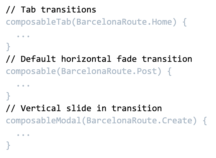
Since the Jetpack Navigation API limits the data to parcelable types, it’s very hard to have incorrect connections between screens (for example, setting a Listener on a Fragment that will become obsolete if the activity gets recreated), yet you can still do what you need.
A good app is a UI framework and…
I’ve extolled many benefits of adopting Compose, but of course that’s just a piece of the picture. You can write bad apps and UI in any framework. We were able to staff a high-quality team of Android engineers to help build Threads, and we couldn’t have done it without them.
Most of the team was actually new to Jetpack Compose, but they were able to pick it up very quickly just by following our existing code in Threads.
We didn’t have an example of a Compose app that was built at our scale, so we had to figure out as we went what was necessary and how it would work. We took an approach of honoring clean code principles responsibly, while avoiding early abstractions, and iteratively updating our architecture as the app evolved.
Challenges with Jetpack Compose
Upgrading Compose and AndroidX libraries for all of Meta
At Meta, we have a monorepo, where nearly all of our Android apps are in a single repository. We also share the same version of Kotlin, as well as the same set of third-party library versions, including the AndroidX libraries. This helps us share code between our apps as necessary.
This means, when somebody upgrades Kotlin or an AndroidX library including Compose, they’re upgrading it for Threads, Instagram, Messenger, Facebook, the Meta Quest app, and more. It’s an extensive undertaking—yet one that has a notable positive impact.
Unlike with many other AndroidX libraries, each Jetpack Compose upgrade can yield significant performance benefits and capabilities, so we’ve improved our abilities to upgrade AndroidX libraries in the process. When Jetpack Compose 1.5.0 became available, we had our codebase upgraded within 30 hours and rolled it out in the next version of Threads.
Stability
It’s fairly easy to deal with stability issues when you find them, but if you aren’t looking for them, these issues can fly under the radar. When dealing with legacy code and an app that’s starting to get big, you’ll notice that stability plays a much bigger role in recomposition, especially in the root of your screens.
You probably know that Compose offers a compiler report that will give you stability information about the classes, and also @Composable functions in your codebase. But it doesn’t help you with other things, namely:
- Whether you are calling a function in a way that it can never be skipped (e.g., an argument that will never be treated as stable/equal).
- Whether lambdas in your function will be recreated due to capturing an unstable value.
Calling a function such that it can never be skipped
Even if you take care to write a skippable function, you still need to make sure that you are providing values that will allow the function to be skipped. A few interesting gotchas that will make your function not be skipped:
- A modifier with a “composed” element (e.g., “clickable” at this time of writing, or other custom composed modifiers that you’ve created).
- A modifier value created in a helper function that isn’t
@Composable. - A lambda function that captures an unstable value.
Composed modifiers
A “composed” modifier is always recreated on each composition, and passing this modifier to another Composable function will never allow it to be skipped. If you want this function to be skipped, an easy solution is to pass necessary information as arguments instead of the composed modifier itself, and allow the skippable function to create the composed modifiers.
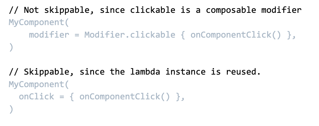
Modifier value with lambda created via a non-Composable helper function
In this scenario, you want to avoid a “composed” modifier, but you want some helper function to create a series of modifiers for you. So you create a simple helper function.

The problem here is the use of a lambda. While Compose will effectively, automatically “remember” lambdas in @Composable code, it will not do so if your function is not @Composable. In that case you’ve gone the opposite way and made it not compositional enough.
You have a couple of solutions:
- Use a single instance of the Modifier if you never need to pass its parameters.
- Make the helper function
@Composableso that it can remember the lambdas across recomposition.
Lambda function capturing an unstable value
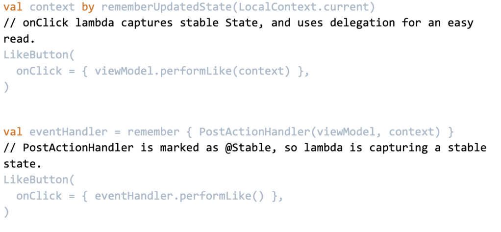
I just mentioned that Compose will effectively, automatically “remember” lambdas in @Composable code. It only does this, however, if the values that it captures are considered “stable.”
We were commonly capturing unstable values in Threads, especially due to some of the Instagram codebase we were inheriting. A lot of helper functions require a Context. Context is not considered stable.

No compiler metric will warn you about this instability, so you have to be on the lookout for it yourself.
There are a few solutions for this:
- Wrap the unstable value in a
rememberUpdatedState. - Wrap the unstable value in your own “stable holder” (a helper class that is marked as stable, and serves to hold any unstable value inside).
- Wrap the unstable value in some other stable helper class.
<code snippets>
Lambda functions affect more than function calls
So, passing lambda functions capturing an unstable value as arguments to a function will prevent that function from being skipped.
But the impact can be much more widespread. Many things in your composition are made up of lambdas: content, nested content, LazyColumn item definitions, navigation graph builders, and more.
If you have a relatively large function with nested lambdas, all it takes is one tiny inner lambda to capture a single unstable value at the root of the function, and you may end up forcing the entire function to recompose.
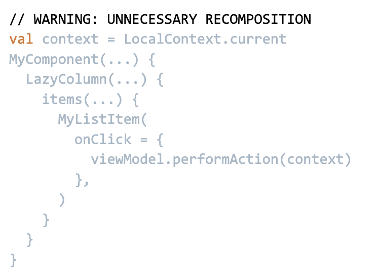
In this example, the onClick lambda needs are capturing context from several layers up. To do so, each parent lambda of onClick has to capture context to pass it down the chain. All these lambdas need to capture the unstable value, so they all get recreated and cause a much larger recomposition impact than necessary.
The solutions are the same as above, namely wrapping the unstable value in a stable holder that will prevent recomposition, but there is one more solution:
Keep your Composable functions small, and avoid over-nesting. You will get a much clearer picture of dependencies on each part of your code, and you’ll avoid the accidental spread of recomposition.
Work on stability when it matters
It’s worth noting that we tackled stability somewhat late into our development cycle, squashing stability issues in the final weeks leading up to our launch. This was probably the right idea, since it let us focus on building the right functionality and then iterating on our architecture to solve tensions as they started to bubble.
It’s also worth noting that working on stability can make code a little harder to read, so I do believe it makes sense to work on this only when you’ve found that it matters.
That being said, I would love it if, when you are passing the same instance around, Jetpack Compose would treat values that aren’t marked as stable types as “equal.” This would prevent a significant set of stability issues.
Growing App Size and Function Arguments
Jetpack Compose’s paradigms favor very detailed APIs. As much as possible, you pass individual data points and lambdas to composable functions, and avoid wrapping them in larger objects.
There’s another clear win for this: The sooner you break down an object into its more basic lambdas and primitive values, the sooner you help avoid some extra recomposition. But there aren’t a lot of examples of what to do when your app grows and this format becomes unwieldy in certain parent-level cases.
Google does mention the suggestion to “factor a collection of state and callbacks into an interface” in the “Hoisted state types” section of its API Guidelines for Jetpack Compose, but it offers a fairly simplistic example.
Here are the areas where we found it worth extracting collections of state or callbacks in Threads:
- Feed-post row information
- Navigations and actions triggered from posts (there are over 30)
To try to reduce the complexity of composition that occurs while you scroll through feed, we currently have a multi-row-per-post format. Some of these row types use a common set of actions/navigations.
We also display the same feed-post rows in multiple screens, such as feed, permalink pages, profile, and likes. Redefining all of these actions, and updating them, would be a bit too labor-intensive.
There are, however, some neat behaviors that you can do when collecting a state of callbacks into an interface. Let’s take our PostNavigator, which collects navigations that can happen from a post.

We have a default implementation that knows how to use Jetpack Navigation to perform these navigations:

But then, when you’re visiting a profile, we don’t want to allow you to trigger a navigation to the profile you’re already on. So we can wrap the navigator:
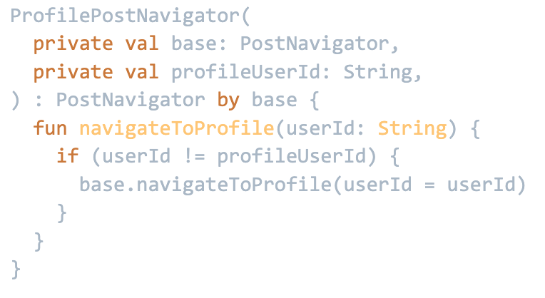
And when we have a nested navigation host with a subset of the graph, we can define which routes go to the nested navigation host:
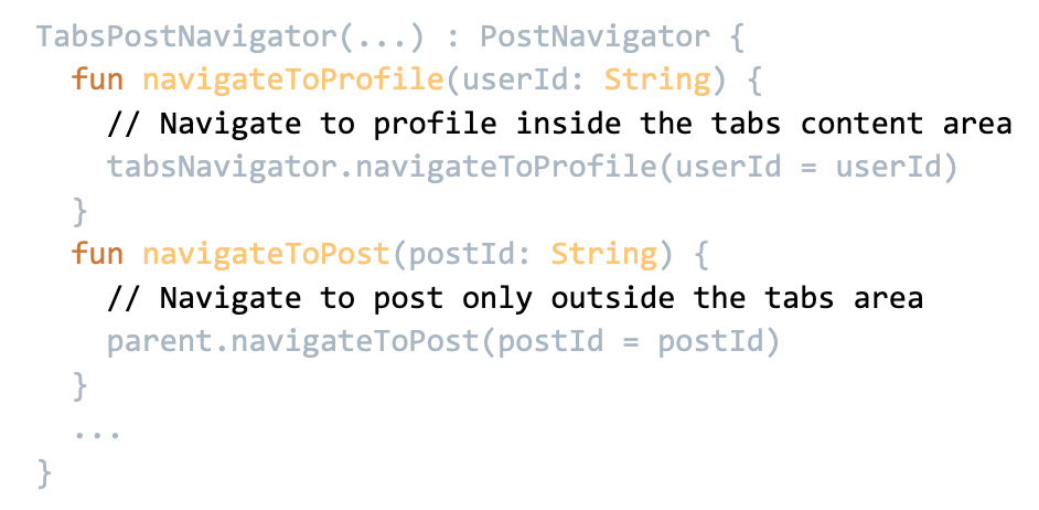
And of course, if you don’t want navigation to do anything, just send the noop implementation.

The interface allows us to wrap and customize our navigation as needed quite effectively, makes it easy to reuse navigation logic across multiple screens, and still prevents components from making assumptions about how to perform any navigation.
If you do wrap your arguments into helper objects like this, keep the object to what the component actually needs, rather than a grab bag of things that may be unnecessary to that component. It will make the code clearer and prevent other changing data from unnecessarily causing the component to be recomposed.
Fun with Jetpack Compose
Pull to refresh Threads logo
I was really happy to see this feature make our final launch. A nice little craft piece at the top of the main feed screen.
Building this Compose made this simpler.
Easier reusability
Components built in Compose tend to be made of modular pieces that can be used easily elsewhere. For “pull-to-refresh”, Material has a SwipeRefreshLayout View that handles gestures, state, and drawing all together.
But in Compose, the “pull-to-refresh” mechanism is split between a pullRefresh modifier for touch handling and PullRefreshState for state management, and a PullRefreshIndicator visual display based on this state.
For our Threads icon logo, we mostly needed to swap out the PullRefreshIndicator.
Easier animations
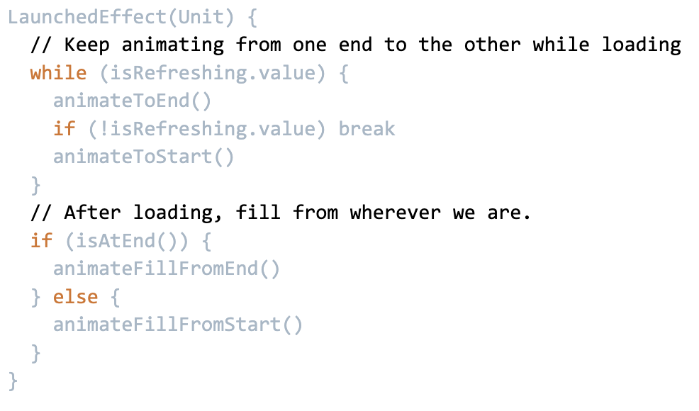
Coroutines make it really easy to run a series of animations. Say, for example, you’ve noticed that while feed is loading, a line will go back and forth through the Threads logo. But did you notice that, depending on which state the animation was in when feed loaded, the logo will fill in from either side?
This is pretty easily done with coroutines, which ends up being something like:
Shared element transitions
There’s nothing like a good shared-element transition to show that you care about craft and polish. It’s not a necessary feature, but it creates a nice feeling when it works. Jetpack Compose doesn’t offer a solution for this yet, so we built our own system for it.
While our shared element system is compositional, we ended up baking it into our navigation controller. This means every screen can easily add shared elements to a composition and automatically transition those elements to the next or previous screen.
It also allows us to transition between different source and target content and decorations, and applies physics-based fling dismissals into the transitions, which gives us that nice effect when flinging away the fullscreen media viewer to get back to feed.
This also made it very easy to add what’s possibly my favorite shared-element transition that few people will see: navigating to the alt-text editor for photos.
UI Tuner
While working on the above transitions, it can be a little tricky to get the feeling right. Android Studio has some live-edit features, but we didn’t have it enabled in our toolchain. Also, I wanted to be able to send a remote designer a build that allows them to play with the values themselves.
When Will Bailey built Rebound, he included an in-app spring configurator that let you adjust tension and friction immediately. Ultimately they found it was better off just letting the designer design it with their own preferred tool and then convert the values to the Android system. In our case, I felt that having something in the app would help.
What I realized is that the Compose version of this is just so easy to use. And because it’s so easy to use composable items as a scope for whether something has entered or exited composition, we can easily show the UI tuner only when there are actually tunable items on screen.
We can easily make our previous SharedElement transitions tunable:

That’s all you need. When this element appears on screen, the tuner system sees that there are tunable parameters, and then can display its editor on screen.
MutableInteractionSource…Set
We haven’t ended up actually using this one yet, but it demonstrates how Compose’s structure makes it easy to do some cool things.
I mentioned earlier that we use a multi-row-per-post architecture for feed posts. So, how might you expect that we show a “pressed” state for an entire post?
Well, you may have noticed that we don’t show a pressed state. But it’s not because we couldn’t get it to work. During development, we used to display a solid light gray color behind a post when it was pressed.
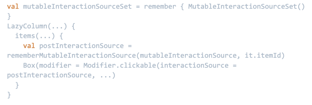
At first, getting this to work was challenging. Compose uses a concept of MutableInteractionSource to hoist the interaction state away from a component, but there’s no easy way to share one between multiple items in a lazy list, and we don’t want to hold and remember a growing list of MutableInteractionSources for every post that we load in feed.
Luckily, MutableInteractionSource is an interface, and so we found an elegant approach and called it MutableInteractionSourceSet.
While MutableInteractionSource holds all interactions for a single component, MutableInteractionSourceSet holds all interactions for multiple components, along with their corresponding keys.
Then, you can create a MutableInteractionSourceSetItem, which is an implementation of MutableInteractionSource and which filters the interactions to just a specified key.
With this, even if you’re creating unique MutableInteractionSourceSetItems for each row of a feed post, they share the same data source, and therefore all end up having the same interaction state.
Launch
By our launch date, we were quite comfortable with our Android app, and we managed to get our pull-to-refresh Threads logo done in time. We had pre-released the app to some creators, and it was really neat to see the bubbling excitement.
Still, we didn’t know how many people would actually use it, and we didn’t know how Jetpack Compose would work in the real world.
As you know now, Threads quickly reached 50 million installs on Android.
Biggest launch challenges
We had no big problems in the Android app related to Jetpack Compose, which was a relief. But we did have some challenges elsewhere.
Underdrawing
On Android 9 devices, if users had dark mode enabled, the app was basically unusable. Any time they scrolled or transitioned to another screen, the content would just paint over itself, without clearing the previous frame. I was worried that this was an issue with RenderNode and Compose, but fortunately it turned out to be a simple issue called “underdrawing.”
When building Threads, I made sure that we were avoiding overdraw as much as possible. I started Android UI development 11 years ago; overdrawing was worth caring about back then, and I stick to that belief. These days, on modern devices, however, it’s not as big of an issue.
The rendering problem was related to an Android attribute resolution for the windowBackground. It turns out, on Android 9 you cannot specify a color literal as the windowBackground. You can, though, use a color drawable.

Performance
Funnily enough, despite worries about performance, we got compliments here! I think it goes to show how sometimes craft and care in other areas can balance some dropped frames.
We did originally notice that our scroll performance rate seemed to be worse than our feed in Instagram, but since we continued to make performance improvements and upgraded to Compose 1.5.0, our scroll performance metrics have reached the same ballpark as the main Instagram feed.
Missing features
One of the biggest criticisms we faced was about the features we didn’t have yet. We’ve since been able to move quickly, however, and in the two months since shipping we’ve added features such as following feed and content search.
Future
We’re really happy with the reception of Threads for Android and how Jetpack Compose helped enable us to build something high quality so quickly.
We’re excited to continue building Threads primarily with Jetpack Compose and to apply our learnings to adopting Compose further in the main Instagram app.


