Unraveling Our Journey from 0 to 1
Threads is a new app built by the Instagram team for sharing text updates and joining public conversations. We kicked off official development of Threads for iOS in early 2023, and after just five months of technical work, we unveiled Threads to the world on July 5th. This is a deep dive into how we developed the Threads iOS app.
Instagram has a longstanding history of crafting high-quality experiences. We knew from day one that if we were going to deliver something that might not have a lot of bells and whistles, it needed to do the things it did do well. You only get one chance at an app’s first impression, and the expectations of a new app from Meta may be higher than those of an app from a new startup. Having engineers already familiar with the codebase meant they could navigate more quickly among the problems that already existed—but we had to make sure we were also pulling in engineers with strong product sensibility who could work independently, without supervision, and make decisions that we’d generally align with.
The Technical Strategy
The core of each platform—iOS, Android, read-only Web—was a small group of engineers, with the expectation that other teams or individuals would be asked to volunteer some of their time. Keeping the team small allowed us to remain nimble and reactive, and lowered the burden of overhead from constantly evolving designs and decisions. Keeping the team small also allowed us to try to keep the project under wraps.
Unrelated to the day-to-day of getting the app up and running, we’d also had a dozen engineers working on what would power our feed-ranking models (what people typically refer to when they say “the algorithm”) and tweaking our integrity systems, to help keep the Threads universe a place where people would want to be.
Wait, read-only web? Initially, yes. When we set out to build Threads, we wanted to make sure we were solving a real problem before investing resources into building something that not many people would use, so we decided to support a read-only version that would support link sharing and offer the ability to participate without needing an account. Read-only has its limitations, but we would go on to ship the web version just a month after the app launch, in part due to an incredible outpouring of support from the community.
Threads on iOS is, at its core, the Instagram app launching with a different app delegate. We use a distributed-caching, large-scale build tool called Buck2 for our code modularity, and part of what that provides is the ability to take a given set of libraries and create from them an .xcodeproj file (what we open in our favorite development environment)—functionally the “app” source code. In iOS apps, the app delegate (UIApplicationDelegate) is the overarching coordinator that knows how to be responsible for kicking off the app. It’s the file that the system interfaces with to handle events, such as the app being launched the first time, or moving to the background or foreground, or that a push notification was received and separates the rest of your iPhone from the app you’re using. The app delegate is the front lobby of a hotel, and it directs everything coming in the door to where it needs to be. Threads needed a new lobby.

Threads

Threads on iOS took Instagram and launched it with a new app delegate. This is largely why our app launched with a large binary and each update’s app size got smaller with each release. We were able to continue pruning and removing dependencies that we knew weren’t being used (or had to untangle to do so.)
Inheriting all of what Instagram did meant there was a lot of stuff we had to undo. More than a decade of battle-hardened code keeps Instagram running smoothly today, but there’s also more than a decade of dark corners filled with cobwebs nobody has blown off in years. A few of our more gnarly bugs were uncovered in the process with thousands of implications. We essentially had two choices: audit every call site, or surgically craft a solution for each specific use case. If you do the latter enough times, you end up with code that isn’t easily maintainable, and we were supposed to be setting an example for other teams on how to execute—which meant we had to adopt both approaches.
While the Threads team was actively making sure we weren’t breaking Instagram, the hundreds of engineers improving Instagram every day had no idea their changes might be changing functionality out from under us. While we have an impressive system of continuous integration, “Does it compile?” isn’t the same thing as “Does this do what we expect it to do?”
The Nitty-Gritty
On IG, every post in every surface (feed post, story, reel, carousel, etc.) is represented programmatically by a class called IGMedia. This object is kind of a “god object” and is more of a repository than a simple data holder, but it’s what we have and what we needed to work with. For all posts in IG, the media is the core content, and any caption you provide augments the consumption of the media. With the new text-first experience, the caption is the core content, with media existing to augment the consumption of the caption. An early exploration of what Instagram might look like in a text-first world involved a quick-and-dirty spot-check rendering only the caption on a regular feed:

All things considered, this doesn’t feel incredibly distant from what would be our first milestone:

Given that we were building on top of Instagram, we also decided to leverage both the ecosystem and branding of Instagram for our onboarding flows. The familiarity of consistent design elements coupled with accounts users offered us a strong foothold into answering some of the hardest questions of “where do we start?”—which also meant we were free to use design elements that have been refined within Instagram over the years, such as the buttons underneath posts, the iconography, the navigation and tab bars, as well as the complicated navigation-controlling logic that ties a lot of those elements together.
So, we had a server that was built to handle what the client parsed as IGMedia objects, a client built to render these IGMedia objects, and a networking stack with dozens of optimizations on fetching, caching, and handling these objects. All we needed to do was figure out the best way to glue them together. IGMedia has different underlying types representing what it is: for instance a photo, a video, a story, a carousel, and so on and so forth. All of these rely on the existence of some underlying media, and we wanted to add a new type to represent none (i.e., a text post).
The infrastructure and tooling of building apps has been improved and optimized over a decade to support Objective-C. Dustin Shahidehpour wrote about the evolution of the tooling to support the Facebook and Meta apps earlier this year. Build times of Swift libraries had recently been greenlit for development of new components freely within Instagram, and we thought this would be a good opportunity to put it to use. Knowing we could use this as a pioneering moment to show that Swift was ready for prime time, we committed to trying to write all new code for Threads in Swift. When the dust settled, a large majority of the code we had written specifically for Threads was in Swift. The remaining Objective-C or Objective-C++ was to interface with code that isn’t quite supported cross-language in our current infrastructure.
Once we had created the data model that would represent these new types of posts, we started building out a new user interface to support them. We knew that starting with the main feed on Instagram would be a poor choice: It’s too complex, supporting dozens of independent types of posts that can be rendered. Instead, we used a similar architecture and went to work writing custom user interfaces for our new app. We did end up using the same buttons underneath a post (a UFI, or Universal Feedback Interface, as we call them within Meta), but it took a decent amount of time to modify it for our purposes, and we likely would have been better served creating a new one: The icons aren’t even identical!
The first week involved getting this new base shell in a usable state, setting up a new app identifier internally, and making sure we could build the app. During that week and the week after, starting each work day felt like playing a lottery ticket: Would we be able to build the app or not? Instagram isn’t built only with “Instagram” code—for example, Instagram utilizes an end-to-end-encryption system to interoperate with Messenger within its messaging system, and it also contains a host of shared networking and core utilities from Facebook—so if someone else isn’t careful, all kinds of dependencies can break what you’re depending on. We have a handful of services and registries that rely on allowlisting or blocklisting certain apps, or on certain flavors of builds (think production versus internal), or automated pipelines), that we touch infrequently because we don’t create new apps every day.
One of the core tenets we’d decided upon as a team and with leadership was that we would have minimal impact on Instagram. As an ethos, this involved things like not introducing technical debt, not regressing or breaking any functionality, and not introducing crashes. All of these are things that most engineers want to do inherently, but they can be hard to stick to at scale. As a simple example, you can think of something like this:
if currentApp == .instagram {

   ...

} else if currentApp == .threads {

   ...

}
But this isn’t great. Why should Instagram need to know what Threads is going to do? Over the last few years the tooling and infrastructure within Meta had matured and explicitly set out to support these use cases.
Standing on the Shoulders of Giants
At Meta, we have a system called sockets that allows the calling code to ask for something to fill the socket and the project itself to define what to return, kind of like plug and play. So instead of the above, we could do something like this:
// Each app has its own color socket
func primaryColor() -> UIColor {
    let colorSocket = getSocket_colorProvider()
    return colorSocket.primaryColor
}

// The code has a default option with an optional socket
func primaryColor() -> UIColor {
    if let colorSocket = getSocket_colorProvider() {
        return colorSocket.primaryColor
    }
    return .black
}
This adds a bit of overhead to small things, but can drastically simplify large and complex boolean statements. This socket system itself was a source of problems early on. When you add a socket (engineers may add these daily for any number of reasons), you add it to a manifest file that successfully registers it with the system…but the manifest file is part of the new app bundle, so it needs to be registered in both applications, even if it’s unused.
There is another piece of infrastructure our apps utilize that lets you register “services” in BUCK that can trigger on certain events, such as when refreshing the feed on app foreground, displaying an in-app banner when a push notification is received, or disabling your “online” status when you background the app. Having these run automatically and removed from the core logic is great for maintaining code, but when you have a new app that’s doing a bunch of
stuff you weren’t expecting, it can add a lot of complexity in the discovery phase. We eventually solved these problems systemically, but the early days were quite chaotic.
Standalone app!
At this point in the client life cycle, we had a husk of an app launching for engineers to build on. The server had had a bit of a headstart working on supporting the new information hierarchy that would be present in Threads: In Instagram, the only way to reply to another piece of content is to leave a comment or send a DM; but in Threads, we were creating new media directly in response to another media (imaging a thread and a reply). After a couple of days of “the app” actually existing, we were left with something that looked like this:

As you can see, this early version has the familiar tab bar and the Instagram UFI. The server, being ahead, was already sending data relating to how we’d track and determine if a post should have been a reply to something else, which let us quickly build out better grouping of information:

We now had replies! Well, kind of… The threadlines were fixed and didn’t signify anything meaningful (such as if other replies were hidden), the like and send buttons didn’t do anything, and two of the tabs were just solid colored views. But you could create a new post (without attaching media) and reply to it. Progress! Over the next few weeks we focused on the constant fostering of an ecosystem that only the team had access to, which was both magical and hugely naive (even with a small team posting fairly frequently, things like fine-tuning how the paging animation works with three new posts versus eight million is a bit tough.)
Most lists within Instagram are powered by IGListKit, a framework we built and open-sourced years ago. In a nutshell, it allows us to focus on passing around ordered sets of data (such as an array of [IGMedia]) that are then independently rendered to the screen, and it includes some efficient ways of handling changes in that data. An adapter takes the data and glues different pieces together, so different data could appear differently in different adapters. The data in this case is passed into an IGListAdapter that delegates what type of IGListSectionController should be responsible for the rendering of that specific object. In Instagram, we have a wide range of list adapters or section controllers responsible for rendering IGMedia on different surfaces. For example, the main feed uses an IGFeedSectionController, which is then responsible for passing off which UICollectionViewCell to use to render a specific post (or parts of a post).
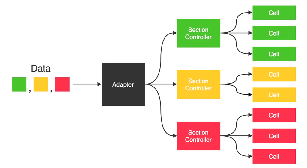
If we make modifications to the ordered array of objects (such as to pagination, pull-to-refresh, or locally deleting a post), IGListKit nicely handles the insertion, removal, and moves of these objects under the hood:

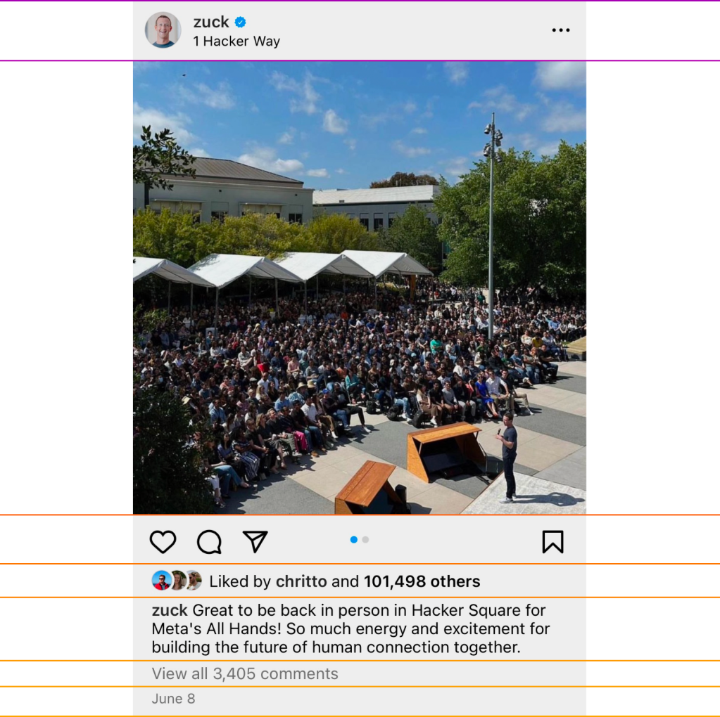
The Instagram feed post can be thought of as a tower of building blocks, each comprising the horizontal width of the device and stacked to compose the entire “unit.” The initial designs for Threads followed this same pattern, and it made complete sense to reuse the existing architecture. Each “post” is a larger cell comprised of multiple independent rows of repeating but unique data:

As this was being teased out and we were forced to live with it, it felt like we weren’t utilizing a lot of the space of the device. For an app focused on text and conversations, we took an intentional pass at our information density:
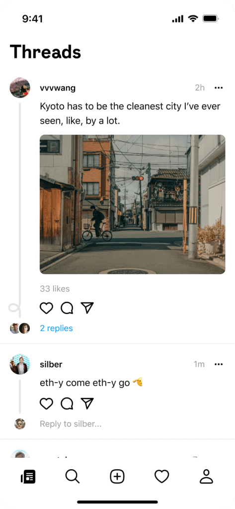
We felt this was an improvement on the emphasis of the content, deferring to what you’re reading to be the star. The changes we’d made here however introduced a complicated engineering problem in our architecture, which now violated the whole notion of “every row is full width”:
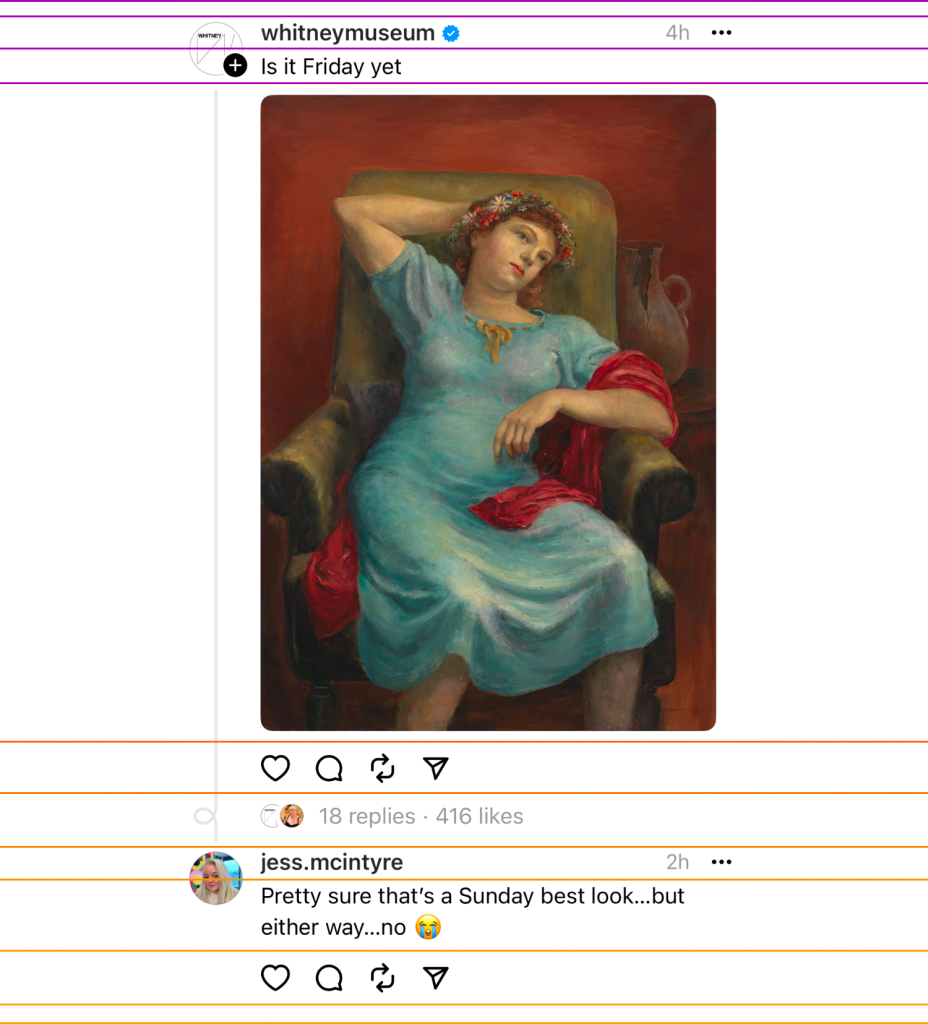
For apps starting from the ground up, the solution here seems quite obvious: Apple added a new API for exactly this type of problem in iOS 13 with UICollectionViewCompositionalLayout. IGListKit has an implicit assumption of—and only supports—layouts conforming to UICollectionViewFlowLayout, the edge-to-edge mechanism, though, which meant that this wouldn’t work. At first glance, our solution seems kind of bizarre: The profile picture isn’t a standalone object in a “header” cell; rather, it’s baked into the “base” cell from which the other rows inherit. We had explored other options, such as non-anchored views for the profile picture, accessory views, decoration views, clipping hacks, but each had their own obstacles before revealing that they simply wouldn’t work. So, we did some math to figure out where the overlap should be, and only included the next row after the profile picture with an offset to provide the illusion of having a single profile picture. Here’s an example showing the picture enabled on each cell without an offset:

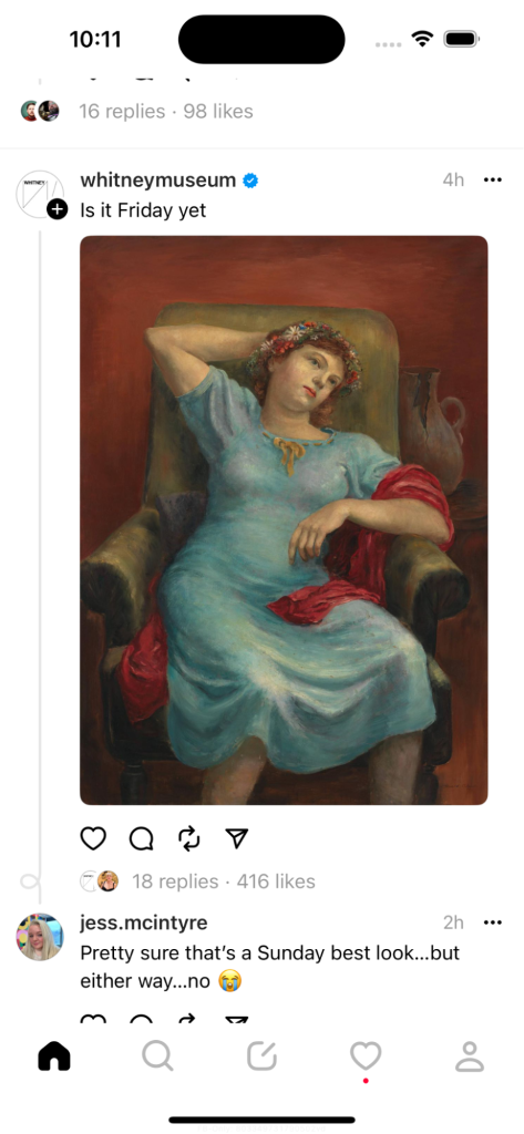
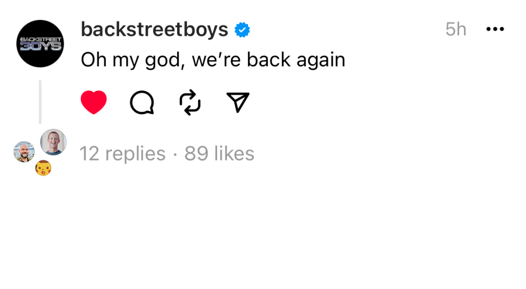
Eventually, we started sending the parent of a post along with the reply, to help fill in the gaps on what a reply was referencing. So if you see a post from @zuck as a reply to @backstreetboys, it helps to know what @backstreetboys said for context. Here’s an example of when you might see the “same” underlying post in your feed (although we try not to saturate you with things you’ve seen):

Remember that decade of implicit assumptions that Instagram had been chugging along with? One of them was that a post could only exist in one place on a single list. Because our ListAdapter was utilizing an ordered collection of IGMedia, this introduced a few problems:
- Uniqueness. IGListKit expects unique objects in its ordered collections, because how do you determine where to put something that’s in more than one spot? In Instagram, this problem doesn’t exist because each feed implicitly only contains a single post exactly once. On iOS, this dedupes silently and removes objects after the first. On Android this crashes the app entirely.
- Caching. Our IGMedia objects act as a single source of truth and are cached locally in a store. If you like media on one surface, we have mechanisms to update this everywhere. At one point, the number of replies and the user profile pictures to display were included here, but the treatment was different across the feeds and the details/permalink page. This meant the version in the cache would be destructively overridden, and navigating back would modify the consumption experience. For example, the picture above is actually two separate points in time, where one has 15 replies and the other has 16 (the one being shown isn’t included in the count.) This means that receiving one would update both—sometimes wrongly.
- Threads. All posts belong to a thread, even if its length is only one post. If you see two connected posts, that’s a thread of size two. Tapping into it might reveal the other dozen or so threads above it, as well as more replies below. But the threading context was part of the media, which fell apart due to the caching problems. In Instagram, there is no real concept of “chained” media. If you want to reply to another post in Instagram, you can kind of fake it by attaching a screenshot or calling out someone else, but there was no (at the time of this writing) concept of chaining or reposts.
We realized pretty quickly we needed to wrap these posts in some other type of data to correctly handle all of these use cases that were completely alien to Instagram. In doing so, we also unlocked support for replies and reposts. Once this was completed, we had achieved our first “shippable” candidate. Building unreleased software is a bit liberating in the sense that if you break something, it’s somewhat acceptable. With this milestone on the books, any day going forward could be our “go” moment, and we’d need to be ready to ship. From this point forward we needed to start maintaining the operational rigor that the rest of our apps have and make sure engineers weren’t landing code that would break or regress functionality.

Slow is Smooth. Smooth is fast.
Anyone who has been involved with shipping a product knows that the hardest part is getting people to use it. Very early on in the process, we decided we would minimize the pain of creating another account by allowing a “sign on with Instagram” experience. Importing your existing data and getting you up and running quickly, as well as removing the obstacles that would otherwise cause you to leave, was critical to the smooth ramp-up. While the sign-up process was always simple, we kept forcing ourselves to use it to make sure we weren’t overlooking anything. Onboarding is a flow that the average user will do exactly once, but it’s a highly critical part of the experience. Every couple of weeks we’d go through the exercise of using the flow again to reevaluate the process and refine our feedback. Ultimately we ended up streamlining the onboarding experience even further.


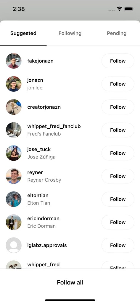

Once the decision was finally made for us to go live, we enabled App Store pre-orders with our launch date publicly—a first for Meta. Back in IG, each user’s profile displayed their joiner number, turning into what would be both a bragging right and a point of entry. As iOS engineers, we typically use iPhones ourselves, and proper iMessage support was critical. We were able to work with Apple engineers to figure out the proper tag support to nicely populate iMessage previews.
Our release was the result of ruthless prioritization, and we’ve since spent a lot of time actively listening to what people tell us they need for a better experience. We’ve worked quickly to squash bugs, introduce new quality-of-life fixes, and add the features that we think will make Threads the best place to have conversations. We shipped early so we could spend time working on the right things. We did and continue to use the voice of the public as an important signal in our decisions about what to spend time on next, and we can’t wait to keep making Threads the best place to be.


