


Intro
At Meta, we have many design systems. Each of the major apps has its own: the Facebook Design System (FDS), the Instagram Design System (IGDS), the Messenger Design System (MDS), and the WhatsApp Design System. And on top of that we have design systems for things like VR experiences, cross-meta experiences such as the Accounts Center, and many, many more. We use this approach to differentiate products and create unique experiences for users across apps.
Each design system is composed of foundational elements, components, and design principles. Meta has more than 20 design systems, which results in an overwhelming number of things to support! Still, our goal isn’t to consolidate down to a single design system, but rather to figure out how to sustainably support the 20-plus design systems we have.
To solve this challenge, we’re working on three major areas:
- Design Systems Platform (DSP): a foundational layer for any design system to represent its foundational elements via design tokens
- Theming infrastructure: makes shipping UI updates faster and easier
- A library of “chameleon components” that support many design systems
In this blog post, I’ll cover how Meta builds UI across apps that have billions of users. I’ll also dive into some of the technical details of how we support the many design decisions in code and, as a result, how we have improved design and engineering efficiency!
Design Systems Platform
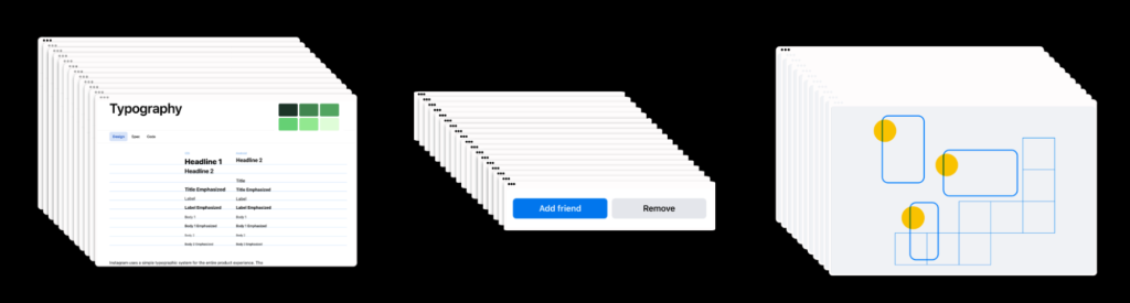
Each design system is made up of three things:
- Foundational elements: colors, fonts, spacing, and so much more
- UI components: the reusable building blocks of the app — components such as Text, Button, Profile Photo
- Design principles: instructional guidelines and UX patterns that provide teams with a set of rules for applying foundational elements and components consistently throughout the product
Design Systems are important for:
- Branding and Consistency: The design system brings brand elements to life through those “foundational elements,” which bake the brand into the foundations of our products and allows us to build out scalable expressions of our brand (e.g., typographic scales, color palettes, branded headers) within products. A prime example is the recognizable “Facebook blue.” Being able to recognize and interact with the same sets of foundational elements and UI components throughout the app leads to predictable, more coherent experiences for our end users.
- Quality and Accessibility: Design Systems raise the bar for quality—with built-in considerations for accessibility, usability, and performance. Designing color palettes that meet color-contrast guidelines, along with accessible and reusable UI components, and ensuring our UI components are performant allows us to solve these problems once and receive benefits across the product.
- Speed: At a product-wide level, having all aspects of a design system collected in one place helps manage design and technical debt—and we can test and release design-language updates at scale faster than we could otherwise. At a feature level, a reusable system reduces the sheer volume of individual design decisions needed to build a product; teams can stay focused on moving faster and iterating rather than on foundational challenges like how to build a button.
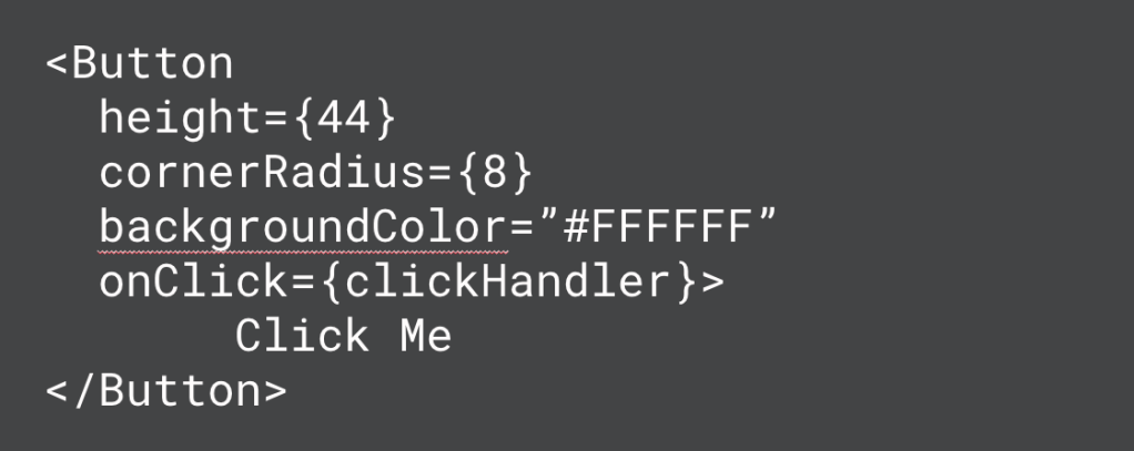
When building UI components in the past, we often hardcoded style values. This makes it super fast and easy to build new components but presents a huge problem for keeping those components consistent, especially when you consider that many of our products ship to multiple platforms, including iOS, Android, Web, and Figma (design).
Changing the corner radius or background color of a button would require coordinated actions from four people: one designer, one web engineer, one iOS engineer, and one Android engineer.
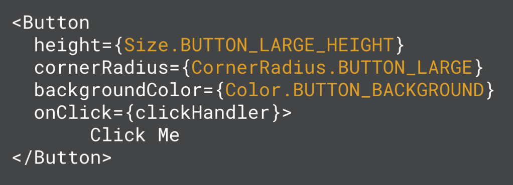
By changing our components from hardcoded values to design tokens, as shown in the comparison below, we can achieve consistency across platforms. Now we can update the token value in one place and have it propagate to all platforms. Rather than referencing a concrete value in the component, we reference a token name instead. And somewhere down the line this name gets resolved into a real value—a design token is essentially a key value pair.
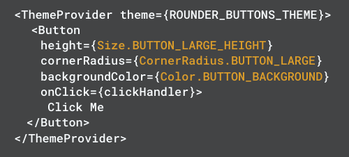
versus
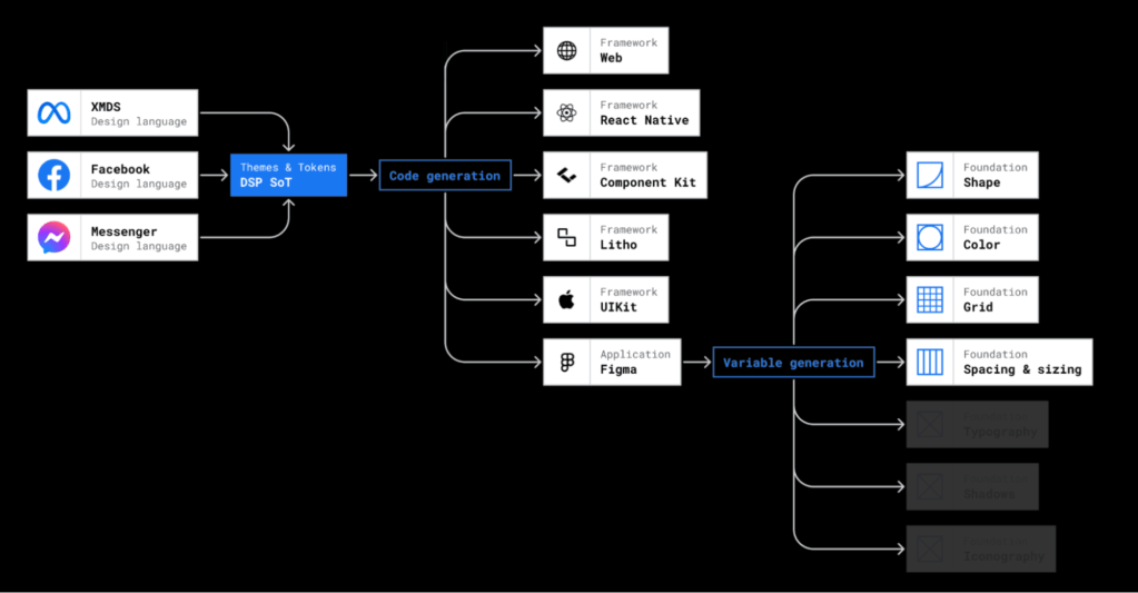
We’re actively working on DSP, which is a home for the foundational elements of any design system, represented via design tokens. This central piece of infrastructure can be used by any design system, and allows for defining the following token types:
- animations
- borders
- colors
- corner radius
- shadows
- size
- spacing
- typography
This platform creates UI consistency and efficiency for design and engineering teams by utilizing a single place to store and update design tokens. Additionally, this has allowed us to standardize our approach to these design primitives across apps and design systems.
Standardization: DSP is generic enough to support any design system on any platform or UI framework. Foundational Elements including colors and typography now work the same way across apps and design systems where possible.
Speed: Automatic sync of tokens to code and design saves time, and design systems can easily expand to new frameworks and platforms.
Consistency: Values remain in sync across platforms in code and design, and there’s little to no coordination cost for updates.
So how does it work?
Step 1: Define Tokens
Each design system first defines its own set of tokens along with a default theme containing values for those tokens (more on theming later). Tokens are defined following industry standards—see the W3C draft specification from the Design Tokens Community Group—to ensure that the way we define tokens at Meta is compatible with tools that get built on top of this standard!
When following this standard, the JSON (JavaScript Object Notation) required for a large design system such as the FDS starts to get a bit large (approximately 40,000 lines of JSON when formatted nicely), so we’ve built some tooling to make this easier to manage. People define tokens using utility functions we’ve built in Hack. We then perform validation and lint rules on the token values and structure, and then generate the W3C-compatible JSON. This tooling is definitely more of a nice-to-have than a hard requirement, though; we could certainly do all of this using just JSON, and we’ve ensured that downstream dependencies are solely dependent on JSON so that if desired we can easily move off of the utility functions down the line.
Step 2: Sync Tokens into Code and Design
We observe changes to the token and theme values for each design system in DSP. When we detect that a change has been made, we automatically kick off a series of sync jobs that propagate that change to all platforms and frameworks where we need it:
- iOS code
- Android code
- React Native code
- Web code
- Figma (design) via Figma Variables
For mobile code in particular, we generate enums for each of the token types (e.g., FDSCornerRadiusToken) as well as lookup functions for each token type.
Example Code:
Enum FDSCornerRadiusToken {
  BUTTON_LARGE,
  TEXT_INPUT,
  BUTTON_GROUP_OUTER,
  BUTTON_GROUP_INNER,
}

Public object FDSThemes {
   Public fun cornerRadius(token: FDSCornerRadiusToken) {
     // return values
   }
}
The goal of this sync step is to make it as invisible as possible—people working on design systems should care only about defining tokens (Step 1) and then using them (Step 3). The rest should be handled seamlessly by DSP.
Step 3: Use tokens in product code
The final step is for developers to use the generated tokens and lookup functions in their code. How this looks exactly varies a bit from platform to platform, but the overall structure is something like:
val cornerRadius = themeUtility.getCornerRadius(FDSCornerRadiusToken.TEXT_INPUT)
By having a standardized abstraction for resolving these tokens into style values on mobile, it opens the door for us to build on top of this foundational infrastructure to enable more wins!
Theming
So far we’ve covered why just having tokens is incredibly helpful. But the truly game-changing benefit is what we can utilize tokens for: theming. Historically, shipping large-scale UI updates takes significant time; theming makes UI updates faster and easier.
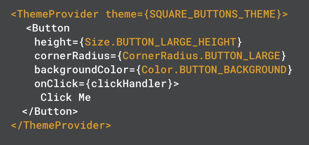
Let’s go back to our example from before of a button component that uses tokens, but with a new twist added.
Our Button is now wrapped in a ThemeProvider, which sets the theme to SQUARE_BUTTONS_THEME. This means that when we go to resolve the tokens used by Button (Size.BUTTON_LARGE_HEIGHT, CornerRadius.BUTTON_LARGE, etc.), we look those values up in the Square Buttons Theme, which can provide new values for those tokens.
So, we can quickly create and apply a Square Buttons Theme (below)—this takes only about five minutes total! And this is just a trivial example. There’s far more we can do using this type of theming.
How does it work?
Each design system first defines a “Default” theme that provides the token values when no other theme is applied. This theme must define a value for every single token within the design system; that way it’s guaranteed that we can always get a style value at runtime.
To start using a new theme such as a “Square Buttons Theme,” the first step is to define a theme that:
- specifies a “parent” theme to extend
- overrides the values it wants to differ from the default theme
So for our Square Buttons theme, our definition in DSP looks a bit like the following pseudocode:
Class SquareButtonsTheme extends DefaultTheme {
   CORNER_RADIUS_TOKENS = {
   BUTTON_CORNER_RADIUS = 0
  }
}
Our codegen process then syncs the theme values into iOS and Android code. The lookup functions that are generated look something like the following pseudocode:
Public object SquareButtonsTheme {
	Public fun cornerRadius(token: FDSCornerRadiusToken) {
		BUTTON_CORNER_RADIUS -> 0
		Else -> DefaultTheme.cornerRadius(token)
	}
}
Using this inheritance-based model allows us to:
- define themes more quickly and easily
- generate theme files with less code
- easily propagate changes from the parent theme to the child themes
The only drawback is that we sometimes have to do a few more lookups at runtime by following the chain of parent themes until we get to the theme that actually defines the values.
So coming back to our example from above, how do the tokens get resolved via themes?
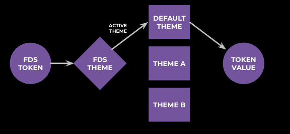
The code for resolving a token value first looks at “What is the active theme?” This is determined based on the theme in which the UI hierarchy is wrapped, or the default theme if no theme is provided. We then delegate the actual value resolution to the active theme:
Fun getCornerRadius(token: FDSCornerRadiusToken) {
	Val theme = getActiveThemeFromContext()
	Return theme.resolveCornerRadiusToken(token)
}
The benefits of resolving a token value:
- Shorter iteration cycle
- For users: Theming enables us to ship design updates to our users faster!
- For teams: Shipping design updates requires less engineering time, and more of the effort required is by designers to define a theme.
- More effective testing
- Volume: Theming enables us to quickly define and demonstrate many variations of look and feel.
- Refinement: Having a number of variations allows us to quickly get feedback through user research and A/B testing, which then allows us to home in on the ideal UI and ship it to users.
Chameleon Components
Tokens and theming are amazing for representing the foundational elements of a design system such as colors, typography, and more. But another huge advantage of design systems is having a library of reusable components—things such as Button, Profile Photo, Text Input, and more.
Every design system has a component library with anywhere from 15 to 60-plus components, and each component needs to be built on each platform the design system supports. This usually means building the component three times: once on the Web, once on iOS, and once on Android.
And each component is a lot of work! Each one needs to solve for:
- Usability: Are our components easy to understand and interact with?
- Accessibility: Do we have screen reader support, meet color contrast standards, and much, much more?
- Quality on the whole: Do we have other quality aspects users expect such as touch states, proper text scaling and truncation, support for right-to-left languages, and more?
We’re building “chameleon” components that change their appearance to match the host app. By investing in a single-component library that can look like any design system, we are more efficiently investing in having a canonical implementation of building-block components rather than having every single design system spend effort implementing and maintaining them.
While this might sound straightforward, there are several challenges that need to be solved for these chameleon components to work:
- Differences in component functionality across design systems: These are things like “FDS list cell accepts a title and subtitle, but MDS list cell only accepts a title” or “FDS button accepts a left icon and a right icon, whereas XMDS button only accepts a right icon.” These differences are hard to encapsulate in a single API that allows each design system to achieve its desired functionality.
- Restricting property types and enforcing design system rules: This challenge is similar to the first one, with key differences. Design systems have rules that need to be enforced in the component API to avoid incorrect usage. Examples of this include: FDS Text should only accept FDS Colors (and same for MDS, IGDS, etc), and FDS Button should only accept FDS Icons (and same for MDS, IGDS, etc). These rules are also hard to enforce in a single API.
But what about tokens? Can’t we use them to solve these problems? Tokens and theming are great for a single design system, but they don’t provide an overarching solution for when we need multiple design systems to be supported simultaneously. Different design systems have different sets of tokens and different constraints to enforce, which can’t be done by tokens alone.
Introducing “Variants”
To solve these two problems, we are powering chameleon components with variants. Variants (or “component variants”) are an abstraction layer on top of tokens and themes that allows different design systems to work together in a single component. This isn’t a new concept: We’ve borrowed this name from the existing design concept, and it maps fairly one to one, so this is just encoding it technically.
Variants provide a schema of configurable style properties for a component:
With that high-level understanding of the concept, let’s take a look at how it actually works in code.
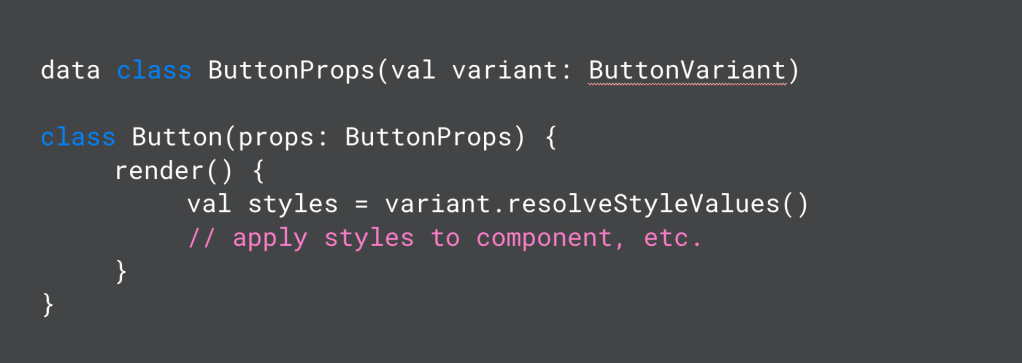
First, variants are a direct part of the component API:
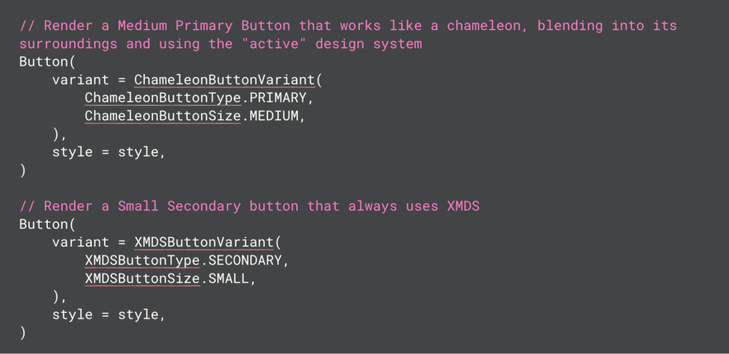
Variants can be thought of as a contract between the design system and the component style. We take in the variant as a prop on the component, and the variant internally produces style values that the component can render:
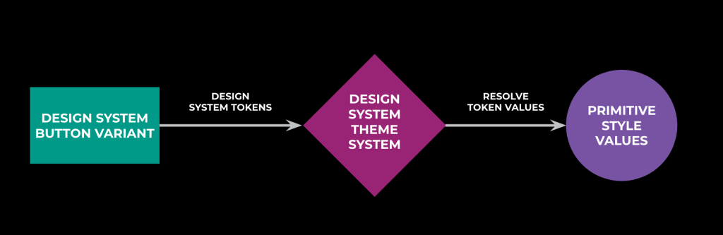
You can see in the variant-resolution flowchart that we are leveraging tokens and theming internally within the variant to resolve the values of tokens. To go from XMDSButtonType.PRIMARY and XMDSButtonSize.SMALL to actual style values for a button, we delegate token resolution to the design system themes. This allows us to respect the active theming for each given design system, which ensures that the rendered UI matches on the screen the look and feel of other components from that design system.
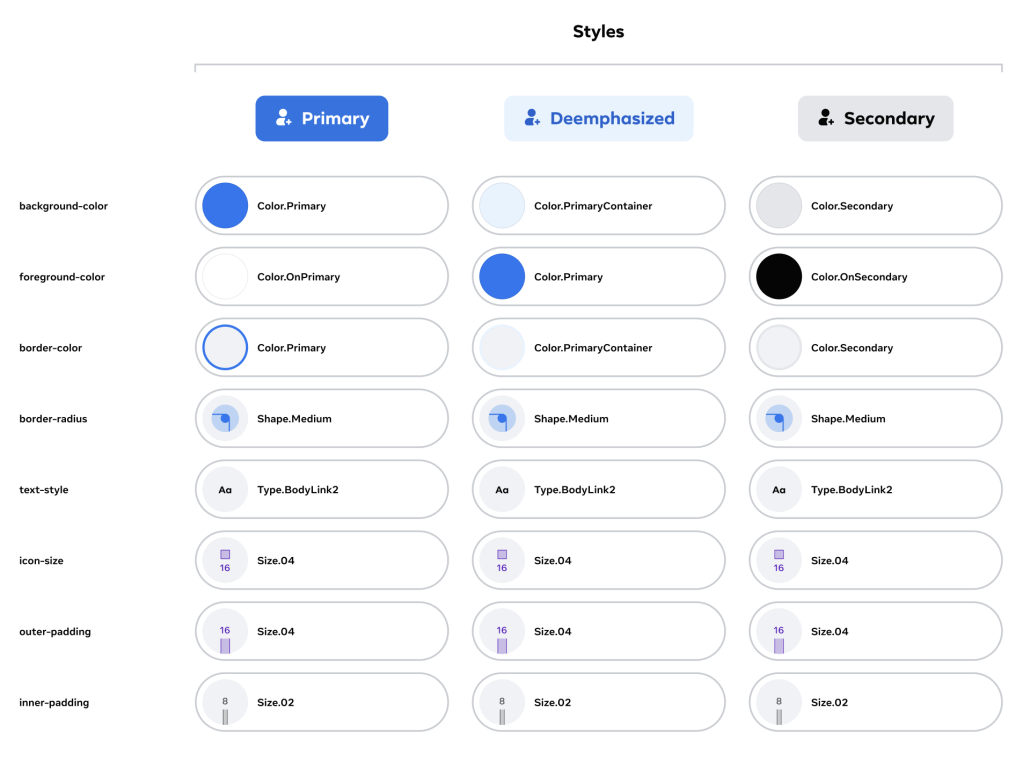
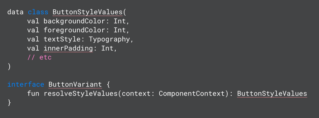
Every variant object for a given component conforms to the same interface that returns the style values. You can see for Button that this includes styleable properties such as background color, text color, text style, padding, and more. This is essentially encoding the image we saw above of configurable style properties for the component:
The result of this abstraction layer is that the actual implementation of the component is devoid of any design system-related code! The component implementation receives style values from the variant and focuses entirely on rendering the component itself using those values.
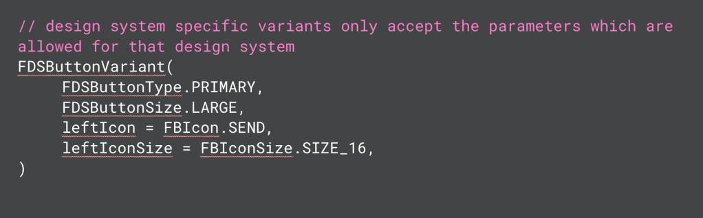
Another significant advantage of variants is to enforce design-system rules. By doing so, the variants account for differences in design-system functionality. Design-system variants should enable the full functionality of that design system without being overly permissive. For example, a FDS Button should accept only FDS Icons. Variants allow us to enforce this through parameter type safety. The same applies to the other problem we discussed earlier—differences in component functionality. The FDS variant can accept a left and a right icon, while the XMDS variant can accept only a left icon. The Button component knows it gets a possibly nullable left icon and renders it if it’s not null.
So in summary, solving for many aspects of quality and accessibility in a single component enables every design system to reap the benefits.
Conclusion
There’s a lot of work in a lot of different areas to make design systems successful at Meta. Tokens enable a single design system to scale to many platforms through the strong foundation of Design Systems Platform. Theming allows each app to iterate on UI and deliver better experiences to users, and to deliver them faster. And our library of chameleon components allows us to scale our efforts on component building more efficiently across apps and design systems.
There’s a lot of exciting work going on in this space, and it’s powering experiences for billions of people each day!

